Building Scalable Design Systems in 2024
A comprehensive guide to creating and maintaining design systems that scale with your team.
Building Scalable Design Systems in 2024
Design systems have become crucial for maintaining consistency across products and teams. Here's how to build one that scales.
What is a Design System?
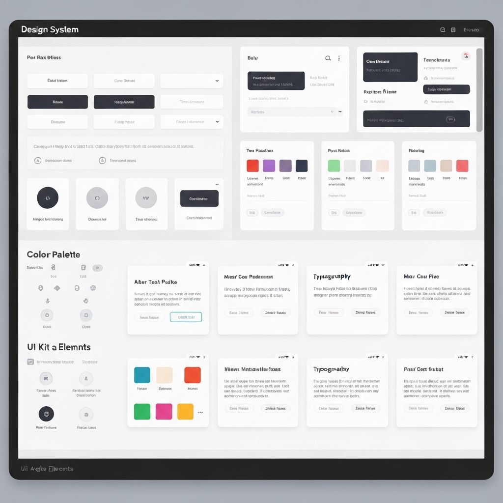
A design system is a collection of reusable components, guided by clear standards, that can be assembled to build applications.
Key Components
1. Design Tokens
Design tokens are the foundation of your design system:
\\\`css
:root {
--color-primary: #3b82f6;
--color-secondary: #8b5cf6;
--spacing-sm: 0.5rem;
--spacing-md: 1rem;
--spacing-lg: 2rem;
}
\\\`
2. Component Library
Build reusable components with consistent APIs:
- Buttons
- Form inputs
- Cards
- Modals
- Navigation
3. Documentation
Clear documentation is essential for adoption:
- Component usage examples
- Accessibility guidelines
- Design principles
- Best practices
Implementation Strategy
1. Start Small: Begin with core components
2. Get Buy-in: Involve stakeholders early
3. Iterate: Continuously improve based on feedback
4. Automate: Use tools to enforce standards
Tools and Technologies
Popular tools for building design systems:
- Storybook: Component development and documentation
- Figma: Design collaboration
- Tailwind CSS: Utility-first styling
- shadcn/ui: High-quality component library
Conclusion
A well-designed system improves consistency, speeds up development, and creates better user experiences across your products.
Comments (2)
Great article! Very informative and well-written. Looking forward to more content like this.
Thanks for sharing this. The examples really helped me understand the concepts better.